Tuesday, August 26, 2014

Anticipation

Anticipation is used to prepare the audience for an action, and to make the action appear more realistic.  A dancer jumping off the floor has to bend his knees first; a golfer making a swing has to swing the club back first.


The technique can also be used for less physical actions, such as a character looking off-screen to anticipate someone's arrival, or attention focusing on an object that a character is about to pick up.


Squash and Stretch

Squash and stretch gives a sense of weight and flexibility to drawn objects. It can be used on simple objects, like a bouncing ball, or more complex things like faces. Taken to an extreme, somethings stretched or squashed can have a comical effect.  In realistic animation it is important an object's volume does not change when squashed or stretched. If the length of a ball is stretched vertically, its width (in three dimensions, also its depth) needs to contract correspondingly.


Links That Discuss More on Squash and Stretch

Animating in 2D

  •         Disney's Twelve Basic Principles of Animation is a set of principles of animation introduced by Disney animators Ollie Johnston and Frank Thomas in their 1981 book The Illusion of Life: Disney Animation (This is a great resource if you are interested in animating)(Ollie Johnston and Frank Thomas are two of Disney's Nine Old Men; Disney's core animators known as Animation Legends). Johnston and Thomas based their book on the work of the leading Disney animators from the 1930s onwards, and their effort to produce more realistic animations. 

  •         The main purpose of the principles was to make an illusion of characters who's movements follow the basic laws of physics, but they also dealt with more abstract issues, such as emotional timing and character appeal.
The 12 Principles

Follow Through And Overlapping Action

Mark Kennedy is a great resource on all things animation and He Covers This Very well >>
This will be repeating what he says, and more


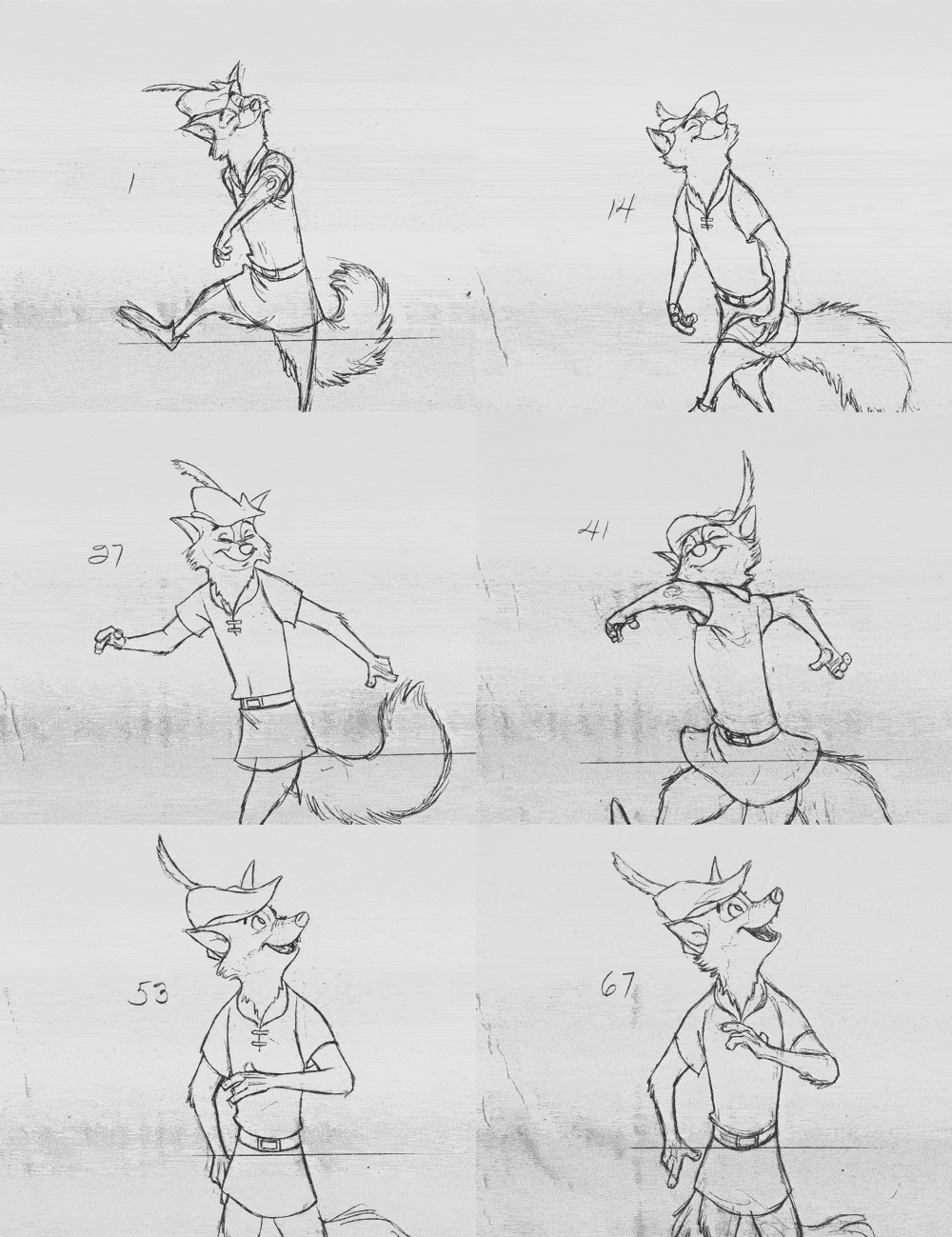
"Follow through" means that loose parts of a body should keep moving after the character has stopped and the parts should keep moving past the point where the character stopped and get pulled back towards the center of mass or for most characters the torso. "Overlapping action" is having parts of the body to move with different timing and speed (an arm will move on different timing of the head and etc).

 A third similar technique is "drag", where a character moves and parts of him take a few frames to catch up.These parts can be objects like clothing or the antenna on a car, or parts of the body, such as arms or hair. On the human body, the torso is the core, with arms, legs, head and hair that normally follow the torso's movement. Body parts with more tissue, like large stomachs and breasts, or for example loose skin on a dog, are more prone to carry drag movements than bonier body parts.

Also One thing to note.  When people turn their head they close their eyes.  Try it yourself and watch others do it.  You'll find you and others unconsciously do it all the time, and it feels weird when you force yourself to keep your eyes open when you turn.


 Exaggerated use of Drag can make a comical effect, while more realistic animation has to time the actions exactly, to make a convincing result.
The "moving hold" animates between similar key frames, even characters sitting still can display some sort of movement, such as the torso moving in and out with breathing.


When I (Mark Kennedy) was animating for a living, there were some animators that would leave off the secondary action until they had worked out the action (and the acting) first. Then when the director approved the scene they would go back and add the hair, clothes, etc. Or even have an assistant do it for them. That way you're focusing on the most important part of the scene first without worrying about the secondary action.

Nothing wrong with this of course. Personally I (Mark Kennedy) couldn't do it, It drove me crazy because it always looked stuck on if you added it second. And drawing a bald or naked character just always looked so lame I couldn't bear to show it to a director. And as I've said before, for me my drawings have always been best when I conceived them all as one thing. Each drawing is one design in and of itself. How can you add later and have it still look good? This is why I don't use a Cintiq at work - it encourages you to work and rework each part of a drawing seperately. I hate that! If I don't draw it all as one thing (including background and all the characters all at once) then I never like it. I tend to draw really fast and the Cintiq and Photoshop can't seem to keep up with me...but I digress. This post is supposed to be about follow through!


I feel seeing it demonstrates more and is easier to understand than words alone so here are more examples


Stretch on Squash on opposite sides of figure

Mark Kennedy is a great resource on all things animation and He Covers This Very well >>
This will be repeating what he says


The other way to organize your figures is to make one side of the figure squash and the other sidestretch.

Walt Stanchfiled talks a lot about this in his notes. Check out all the ones posted on Animation Meat for great information on stuff about drawing.

For those of you unfamiliar with animation terms, squash and stretch are usually used to describe how forms are affected by force. When a figure runs fast, it s-t-r-e-t-c-h-e-s out, and when a figure gets hit on the head by a safe it squashes down.

Squash and stretch is a part of all animation and not just in extreme actions. Squash and stretch are essential to the subtler aspects of animating as well. Squash and stretch are integral to changing a character's expression, which is the key to the "Illusion of Life" - the conceit that an animated character is a living, thinking being. The subtle change from eyebrows slightly lowered to eyebrows a little bit higher (from a squash to a stretch) can make the viewer believe that a character is having a realization and convince an audience that the character is real.

Anyway, this post is about a different use of squash and stretch. Just as we were talking about in the previous post, this is a helpful tool in terms of avoiding symmetry. Make one side of the figure squash and the other side stretch.

This is true to real life too. The way our muscles and tendons work make our limbs look this way. And when you bend over to touch your toes, you can feel the stretch that goes from your heel up your leg across your back and up to your head. And you can feel your stomach squash.

It’s a helpful way of organizing your drawing and emphasizing the forces that are happening.


Don't forget that it applies to clothing as well. Clothes are always a reflection of what the body is doing. 


Most drawings have sides that alternate between squashes and stretches. As the body leans and tilts this way and that, It will lend itself to a rhythmic series of squashes and stretches on alternating sides.


Walt Stanchfield pointed out that this even applies to hair. The hair of the figure should squash on the same side that the figure squashes and stretch on the same side too. Otherwise the drawing can look disorganized or the ideas can cancel each other out. 

This Alice model sheet is full of some good examples. Some are pretty subtle. I've highlighted the two most clear examples. Obviously, you can put all the hair on one side or the other as well.


I wish I had more examples to go with these last two posts, but it's very time consuming to hunt through all of my books and scan stuff for posting. Maybe I'll dedicate a post to just artwork that shows these two concepts at work sometime.
*A caveat to these last two posts:
 keep in mind that these last two concepts deal with drawing on a graphic level. These methods run the risks of making you think of your drawings as just lines, which can be very limiting. Every great artist learns to portray forms in space and think three-dimensionally before attempting to draw on a purely graphic level. Picasso, Mary Blair, all the great artists who pioneered the flat UPA style - all of them learned to draw in the traditional way before transitioning into a more stylized and flat style. So keep these last two things in mind while you draw but also always think of your drawings as forms in space as well.


Symmetry and Contrast

Mark Kennedy is a great resource on all things animation and He Covers This Very well >>
This will be repeating what he says

when you are trying to create good art symmetry is not usually your friend. Symmetry flattens things out and makes them uninteresting. Contrast is desireable for visual interest and symmetry is the opposite of contrast.


We don't want both sides of a figure to be symmetrical. We need to find variety in our poses so that each side is different. Here are a couple of simple tricks to help you do this.


Be aware that it switches back and forth from side to side in most drawings (like it does in both of these bird poses). Below, see how the spine is a simple straight and the belly shows the structure, then in the head it switches: The underside of the beak is the gesture line and the top of the head is the structure side:


One side of the figure is a simple line. It's the line of action, it contains the gesture and the force of the pose (usually it's the side with the spine). The other side is a more complex line and it contains the other stuff that makes the drawing look like it has volume: it has all the anatomy, the breaks in the clothes, etc.

This also creates a cool visual contrast: there's a simple side and a complex side. That creates a contrast that's pleasing to the eye. 

A figure with two simple sides looks too plain and uninteresting. 

A figure with two complex sides lacks force and has an unclear gesture.