Friday, August 29, 2014
Figure Drawing Making Strokes
A stick of conte is held with the thumb and middle finger, the Index finger is used to add a variety of weight and pressure on the conte to control value and thickness of the stroke you lay down on the paper.
These are not my images but you've probably noticed the nupastel used in these images have a sharp point. Some people like to sharpen there points using sandpaper, or razors. Its not necessary, but having the point does add to the different types of stokes/ lines you can lay down on the paper.
After prolonged use conte (nupastel charcoal etc) will naturally form a sharp tip

Broad wide strokes are created using the broad edge of the stick. Laying it flat but on an edge and dragging across.

you can form lines by using the side edge once again but by pulling or pushing

You can use your knuckle, I use the back of my hand

he uses a piece of toile cloth, you can use a paper towel

using the kneaded eraser you can simulate lighting and highlights by pulling pastel off the sheet
Ryan woodward is an amazing artist who has labeled the strokes in his gestures to help students explore and understand how different strokes edges etc can be used to lay down conte.


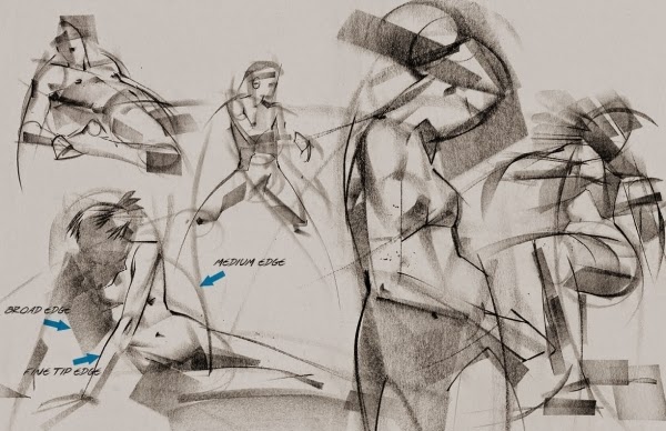
Figure Drawing Materials
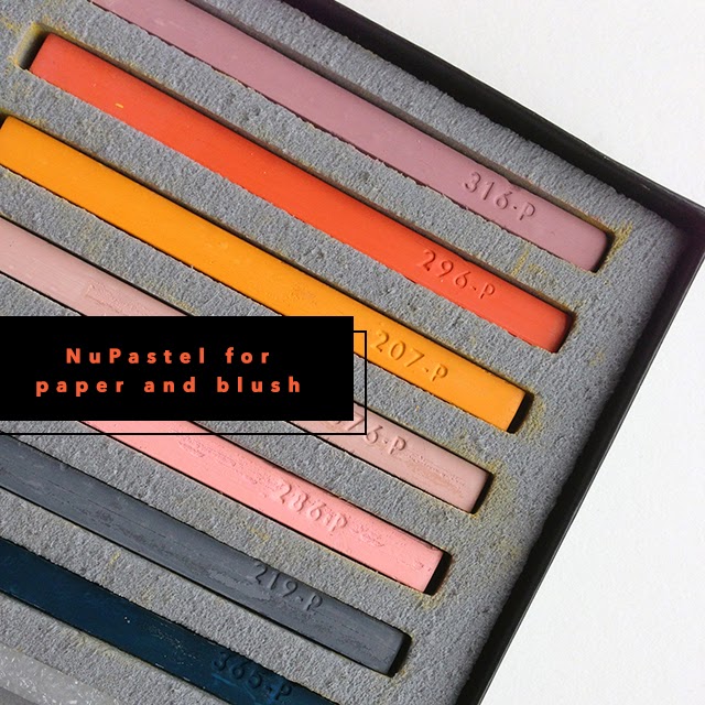 Nupastel charcoal or Conte - I prefer nupastel, it's a lot softer so harder to control but more forgiving if you make mistakes (easy to rub out and erase). If you master the use of nupastel you have good control in laying down strokes. Conte is very good as well, is easy to make a variety of strokes from dark thick and strong to light soft and thin, but conte is very unforgiving, once a stroke has been laid down its not going to go away.
I prefer to use bottle green, black or some kind of dark valued pastel
Paper towels, Kneaded Eraser, and a normal eraser are very useful


Drawing Board &
Newsprint paper 18"x 24" inch (45.72 x 60.96 cm) usually you can buy them in 50 sheets


Wednesday, August 27, 2014
Silhouette
The Silhouette of a character is very important. Most people don't realize how important silhouettes are. Characters who have great silhouettes are the ones that work. They are easier to see, more appealing, and you can also understand the function and personality of an object/character by it's shape.. for example here are the silhouettes of several characters. See how many you can recognize


as example of how with silhouettes you should understand the characters function. By just looking at their silhouette you should be able to figure out what each of these characters specialize in?
It is very important in animating and in posing characters. Good silhouettes makes it easier to recognize what is occuring in a scene and makes good storytelling.
Disney uses shape to design characters. Using circles for friendly and soft, squares for stable and strong, sharp for dangerous, and active is widely accepted and used
Light and Shadow
From Mark Kennedy's Temple of the Seven Golden Camels
"So Blogger has been pretty much inacessible for the last 24 hours...at least whenever I tried to log in or read the comments. Since I started Blogging over 2 weeks ago I haven't gone a day without posting at least once. Hopefully this will work and I won't break my streak. Still it seems very ungracious to criticize such an amzing and FREE service. How does Blogger do it?
Okay, so there were a couple of requests for more stuff about light and shadow. Many drawing books do a great job of covering this, but these were done by Rowland B. Wilson and seem to be especially geared towards animation layout and story sketch.
Okay, so there were a couple of requests for more stuff about light and shadow. Many drawing books do a great job of covering this, but these were done by Rowland B. Wilson and seem to be especially geared towards animation layout and story sketch.


Those of you that haunt the same corners of the internet that I do have probably seen the handouts by Rowland on "Layout" and "Painting". But this one took a lot of detective work to find, so I'm betting most of you haven't seen it. I'll post more on this topic later...I've got so many threads started and posts already saved in Blogger that it's getting unreal to keep track of it all!
I met Rowland when I started on "Hercules". Rowland sat in the cublcle across the hall from mine. I was pretty flabbergasted that this legend of illustration was in a cubicle but Rowland didn't seem to care. He was always nice to me and I wish I had talked to him more before he left the studio. He was a super cool guy and an amazing talent."
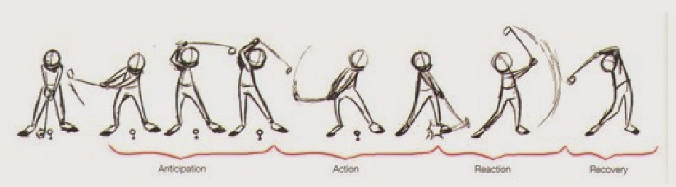
Secondary Action
Adding secondary actions to the main action gives a scene more life, and can help to support the main action. A person walking can swing his arms or keep them in his pockets, he can talk or whistle, or he can show emotions through facial expressions.
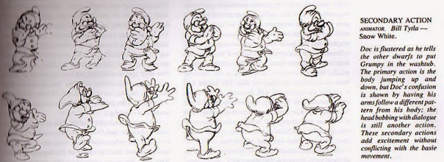

The important thing about secondary actions is that they emphasize, rather than take attention away from, the main action. If the latter is the case, those actions are better left out. In the case of facial expressions, during a dramatic movement these will often go unnoticed. In these cases it is better to include them at the beginning and the end of the movement, rather than during.

The important thing about secondary actions is that they emphasize, rather than take attention away from, the main action. If the latter is the case, those actions are better left out. In the case of facial expressions, during a dramatic movement these will often go unnoticed. In these cases it is better to include them at the beginning and the end of the movement, rather than during.
Archs
Most natural movements tends to follow an arched trajectory, and animation should too for greater realism. For example limbs move by rotating a joint, or a thrown object moving along a parabolic trajectory. The exception is mechanical movement, which typically moves in straight lines.
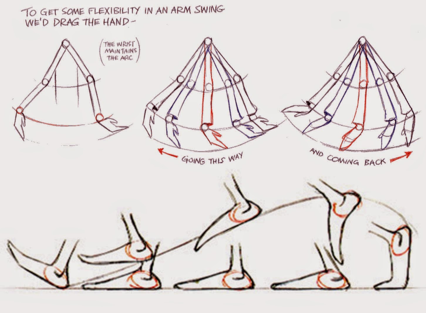
As an object's speed or momentum increases, arcs tend to flatten out in moving ahead and broaden in turns. In baseball, a fastball would tend to move in a straighter line than other pitches; while a figure
skater moving at top speed would be unable to turn as sharply as a slower skater, and would need to cover more ground to complete the turn.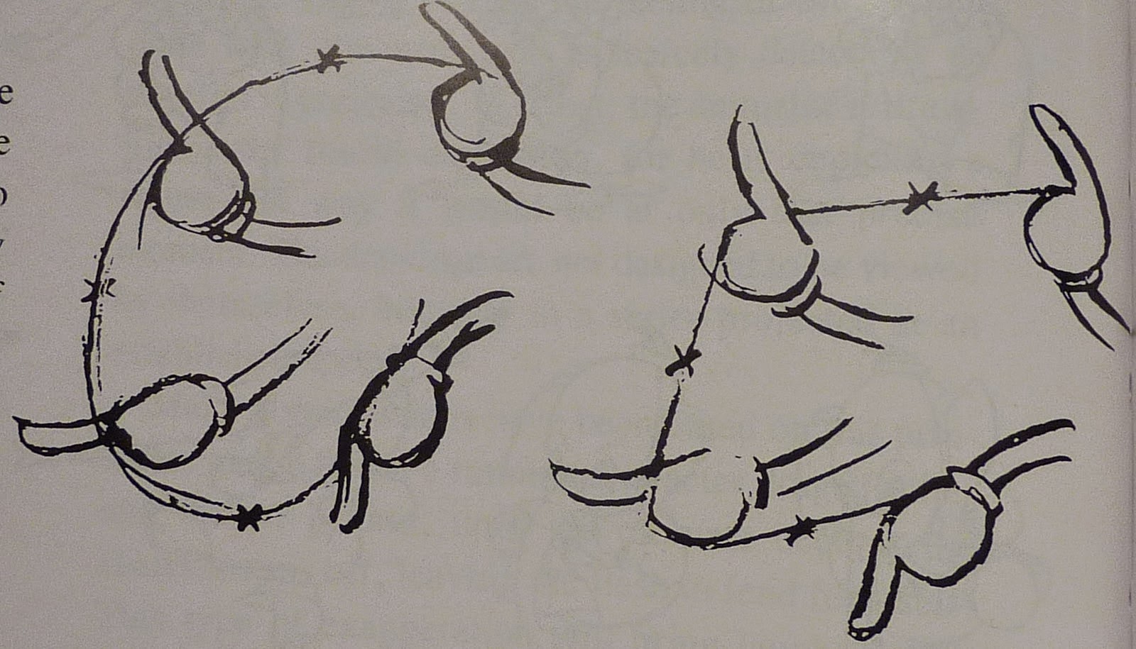
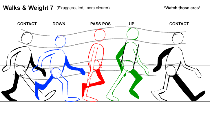 An object in motion that moves out of its natural arc for no apparent reason will appear erratic rather than fluid. So when animating for example a pointing finger, the animator should be certain that in all of the drawings (easy to forget when animating pose to pose) the fingertip follows a logical arc from one extreme to the next. Traditional animators tend to draw the arc in lightly on the paper for reference, to erased later.
Subscribe to:
Posts (Atom)