Friday, August 29, 2014
Figure Drawing Making Strokes
A stick of conte is held with the thumb and middle finger, the Index finger is used to add a variety of weight and pressure on the conte to control value and thickness of the stroke you lay down on the paper.
These are not my images but you've probably noticed the nupastel used in these images have a sharp point. Some people like to sharpen there points using sandpaper, or razors. Its not necessary, but having the point does add to the different types of stokes/ lines you can lay down on the paper.
After prolonged use conte (nupastel charcoal etc) will naturally form a sharp tip

Broad wide strokes are created using the broad edge of the stick. Laying it flat but on an edge and dragging across.

you can form lines by using the side edge once again but by pulling or pushing

You can use your knuckle, I use the back of my hand

he uses a piece of toile cloth, you can use a paper towel

using the kneaded eraser you can simulate lighting and highlights by pulling pastel off the sheet
Ryan woodward is an amazing artist who has labeled the strokes in his gestures to help students explore and understand how different strokes edges etc can be used to lay down conte.


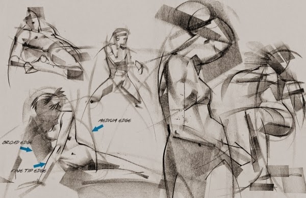
Figure Drawing Materials
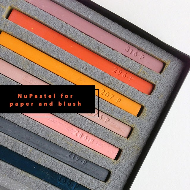 Nupastel charcoal or Conte - I prefer nupastel, it's a lot softer so harder to control but more forgiving if you make mistakes (easy to rub out and erase). If you master the use of nupastel you have good control in laying down strokes. Conte is very good as well, is easy to make a variety of strokes from dark thick and strong to light soft and thin, but conte is very unforgiving, once a stroke has been laid down its not going to go away.
I prefer to use bottle green, black or some kind of dark valued pastel
Paper towels, Kneaded Eraser, and a normal eraser are very useful


Drawing Board &
Newsprint paper 18"x 24" inch (45.72 x 60.96 cm) usually you can buy them in 50 sheets


Wednesday, August 27, 2014
Silhouette
The Silhouette of a character is very important. Most people don't realize how important silhouettes are. Characters who have great silhouettes are the ones that work. They are easier to see, more appealing, and you can also understand the function and personality of an object/character by it's shape.. for example here are the silhouettes of several characters. See how many you can recognize


as example of how with silhouettes you should understand the characters function. By just looking at their silhouette you should be able to figure out what each of these characters specialize in?
It is very important in animating and in posing characters. Good silhouettes makes it easier to recognize what is occuring in a scene and makes good storytelling.
Disney uses shape to design characters. Using circles for friendly and soft, squares for stable and strong, sharp for dangerous, and active is widely accepted and used
Light and Shadow
From Mark Kennedy's Temple of the Seven Golden Camels
"So Blogger has been pretty much inacessible for the last 24 hours...at least whenever I tried to log in or read the comments. Since I started Blogging over 2 weeks ago I haven't gone a day without posting at least once. Hopefully this will work and I won't break my streak. Still it seems very ungracious to criticize such an amzing and FREE service. How does Blogger do it?
Okay, so there were a couple of requests for more stuff about light and shadow. Many drawing books do a great job of covering this, but these were done by Rowland B. Wilson and seem to be especially geared towards animation layout and story sketch.
Okay, so there were a couple of requests for more stuff about light and shadow. Many drawing books do a great job of covering this, but these were done by Rowland B. Wilson and seem to be especially geared towards animation layout and story sketch.


Those of you that haunt the same corners of the internet that I do have probably seen the handouts by Rowland on "Layout" and "Painting". But this one took a lot of detective work to find, so I'm betting most of you haven't seen it. I'll post more on this topic later...I've got so many threads started and posts already saved in Blogger that it's getting unreal to keep track of it all!
I met Rowland when I started on "Hercules". Rowland sat in the cublcle across the hall from mine. I was pretty flabbergasted that this legend of illustration was in a cubicle but Rowland didn't seem to care. He was always nice to me and I wish I had talked to him more before he left the studio. He was a super cool guy and an amazing talent."
Secondary Action
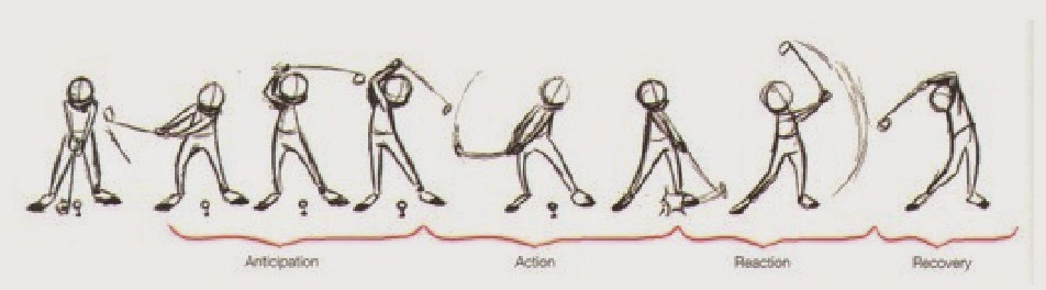
Adding secondary actions to the main action gives a scene more life, and can help to support the main action. A person walking can swing his arms or keep them in his pockets, he can talk or whistle, or he can show emotions through facial expressions.
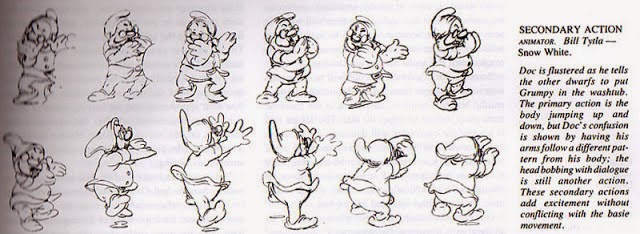

The important thing about secondary actions is that they emphasize, rather than take attention away from, the main action. If the latter is the case, those actions are better left out. In the case of facial expressions, during a dramatic movement these will often go unnoticed. In these cases it is better to include them at the beginning and the end of the movement, rather than during.

The important thing about secondary actions is that they emphasize, rather than take attention away from, the main action. If the latter is the case, those actions are better left out. In the case of facial expressions, during a dramatic movement these will often go unnoticed. In these cases it is better to include them at the beginning and the end of the movement, rather than during.
Archs
Most natural movements tends to follow an arched trajectory, and animation should too for greater realism. For example limbs move by rotating a joint, or a thrown object moving along a parabolic trajectory. The exception is mechanical movement, which typically moves in straight lines.
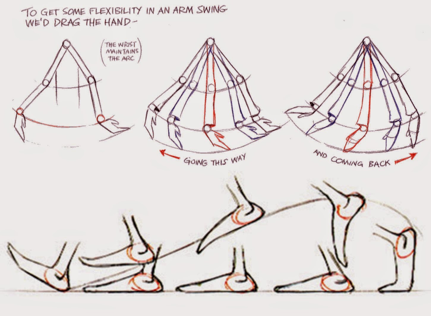
As an object's speed or momentum increases, arcs tend to flatten out in moving ahead and broaden in turns. In baseball, a fastball would tend to move in a straighter line than other pitches; while a figure
skater moving at top speed would be unable to turn as sharply as a slower skater, and would need to cover more ground to complete the turn.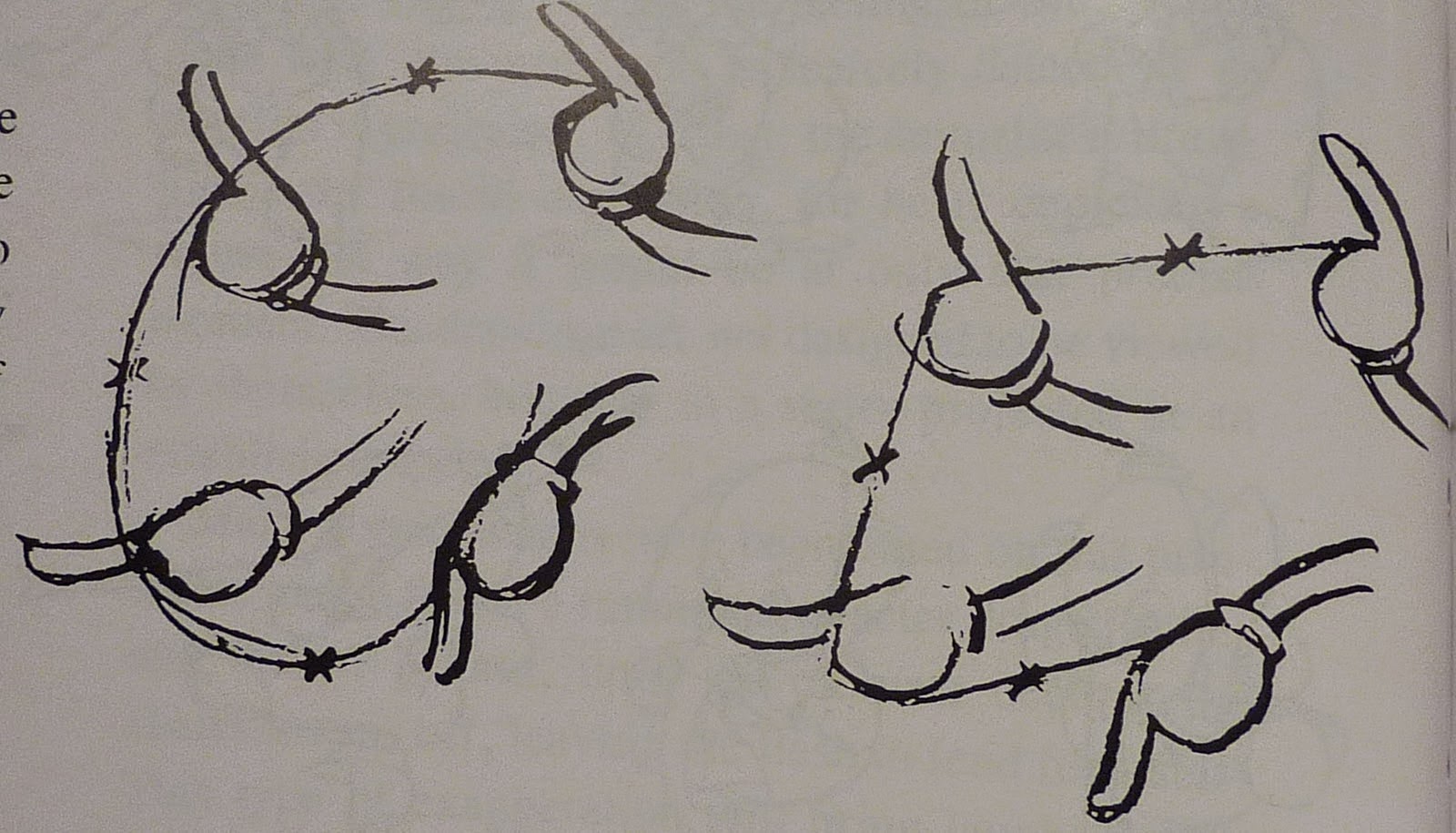
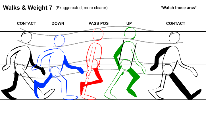 An object in motion that moves out of its natural arc for no apparent reason will appear erratic rather than fluid. So when animating for example a pointing finger, the animator should be certain that in all of the drawings (easy to forget when animating pose to pose) the fingertip follows a logical arc from one extreme to the next. Traditional animators tend to draw the arc in lightly on the paper for reference, to erased later.
Slow In And Slow Out
The movement of the human body, and most other objects, needs time to accelerate and slow down. For this reason, animation looks more realistic if it has more drawings near the beginning and end of an action, emphasizing the extreme poses, and fewer in the middle. This principle goes for characters moving between two extreme poses, such as sitting down and standing up, but also for inanimate, moving objects, like the bouncing ball


Straight Ahead Action And Pose To Pose
These are two different approaches to the actual drawing process. "Straight ahead action" means drawing a scene frame by frame from beginning to end, while in"pose to pose" a few key frames showing major poses are drawn, and the in-between action is drawn in later. "Straight ahead action" creates a more fluid, dynamic illusion of movement, and is better for producing realistic action sequences. But it is hard to maintain proportions, and to create exact, convincing poses along the way. "Pose to pose" works better for dramatic or emotional scenes, where composition and relation to the surroundings are important. A combination of the two techniques are often used.
Computer animation removes the problems of proportion related to "straight ahead action" drawing; however, "pose to pose" is still used for computer animation, because of the advantages it brings in composition. The use of computers facilitates this method, as computers can fill in the missing sequences in between poses automatically. But It is still important to oversee this process and apply the other principles discussed.

The Mouse on top would be an example of Pose to pose, and the bottom running character would be an example of Straight ahead action unless the three figures with arrows above them were drawn in first and the in-between figures drawn in last. The later would be a case of Pose to pose
Tuesday, August 26, 2014
Staging
Staging's purpose is to direct the audience's attention, and make it clear what is most important in a scene; Johnston and Thomas defined it as "the presentation of any idea so that it is completely and unmistakably clear", whether that idea is an action, a personality, an expression or a mood. This can be done using various techniques, such as placement of a character in the frame, the use of light and shadow, and the angle and position of the camera (Also more detail or color contrast, something different like emotion etc works too). The essence of this principle is keeping focus on what is relevant, and avoiding unnecessary detail. In short, it highlights what is happening and what is about to happen.
Mark Kennedy's Tips on focusing Audience attention... link to his original comments>>
For our first example, I did a quick, crummy drawing of a guy taking a picture of a bird in a forest. I did this sketch with two objects of interest (the guy and the bird), which, by the way, is a big "no no" when you're doing story sketch. One of the cardinal rules of story sketch is that you should only haveone idea presented at a time. Each new idea needs a new sketch. Otherwise, the audience is confused and doesn't know where to look.
Also, if I was going to sell the idea that this guy is taking a picture, it would require a closer shot of him and his camera phone, or just the phone, or something. This is too wide and far away to see such a subtle action clearly.
But the point is, I did a drawing with two focal points (and a lot of pencil mileage) to show you how to control the viewer's eye. So here we go...
Here's the original. Yikes! That's a lot of pencil mileage. How can I get the viewer to look where I want them to look?


These days, with compressed production schedules, we tend to expect our story artists to put more thought into exactly how the scene might be lit. That's because the people that have to turn the storyboards into an actual film (the layout artists, animators, lighters, etc.) have, in many cases, very little time to do their jobs. As amazing as these people are at solving problems, if you give them a storyboard that makes no sense from a layout or lighting perspective (or acting wise, for that matter), they're going to have to do a lot of extra work to rework your boards and figure out how to get what the directors wants while retaining what works about the boards. So we try not to create big headaches for the people that will be using the boards as a blueprint for the film, and we try to do things that make sense wherever possible.
So to create light in this room where our character sits reading a book, I would figure out what the best solution is within the bounds of the story. Is a fire in the fireplace right?


It eliminates all the graphic confusion and you can focus on what's important.
This is another useful storyboard trick that has to be considered when you're asking yourself what will be helpful to layout. In a case like this, I would find out what the lighting situation in the gallery would be. I would definitely add lighting to this story sketch to accentuate to two important parts of the sketch (the man and that one painting). But I provide it here as an example of how to use line weight to minimize confusion and enhance readability.
(Personally, I doubt we'd ever design a gallery like that anyway. That's a pretty jumbled mess of paintings!)
Speaking of paintings….the last way I can think of that I use to direct the eye is the old frame-within-a-frame trick. If you create a frame within your composition, you can put the most important element (or elements) in the frame and the eye will be attracted to that spot as a center of interest within the composition.

Mark Kennedy's Tips on focusing Audience attention... link to his original comments>>
For our first example, I did a quick, crummy drawing of a guy taking a picture of a bird in a forest. I did this sketch with two objects of interest (the guy and the bird), which, by the way, is a big "no no" when you're doing story sketch. One of the cardinal rules of story sketch is that you should only haveone idea presented at a time. Each new idea needs a new sketch. Otherwise, the audience is confused and doesn't know where to look.
Also, if I was going to sell the idea that this guy is taking a picture, it would require a closer shot of him and his camera phone, or just the phone, or something. This is too wide and far away to see such a subtle action clearly.
But the point is, I did a drawing with two focal points (and a lot of pencil mileage) to show you how to control the viewer's eye. So here we go...
Here's the original. Yikes! That's a lot of pencil mileage. How can I get the viewer to look where I want them to look?
Here, I added detail to the bird (in the first drawing) and the guy (in the second drawing). Adding detail to an area of a drawing can help draw the viewer's eye to that area of the picture.
The same thing with adding a texture. Your eye is drawn to the texture first because it's a contrast to the rest of the frame, which is all lines of the same weight and empty areas of white. SO simply adding texture can help create an area of interest.
Always remember that the eye will always be drawn to the area of greatest contrast first. The maximum amount of contrast possible in any drawing or painting is absolute black against absolute white. If there's an area with black against white in a picture, the eye will always go there first. If there isn't an area of black against white, the eye will go to the greatest area of contrast, whatever that may be.
Here, in each example, I put black against white in one area and then added grey to the rest of the frame to reduce the amount of contrast in the rest of the drawing. You can see how your eye goes to the area of the most contrast. The big grey areas are minimized and you take them in secondarily.
Here, in each example, I put black against white in one area and then added grey to the rest of the frame to reduce the amount of contrast in the rest of the drawing. You can see how your eye goes to the area of the most contrast. The big grey areas are minimized and you take them in secondarily.
Remember that it doesn't have to be black against white to get the maximum contrast. Anything in the frame that contrasts everything else in the frame will do. Get creative and look for different ways to use this effect to your advantage.
Anything that's different from everything else in the frame will attract the viewer's eye.
If there's a spot of color in a black and white drawing, the color becomes the place of the most contrast and does the job of grabbing the eye quickly.
This is a good point to pause and remember, though, that storyboarding isn't just about being clear and getting the audience to look where we want them to look. You're also trying to tell a story in an effective way, and also provide a blueprint that can be turned into a film. So just because you create a shot like the one above, and it works as a story sketch, it doesn't mean that it works as a film frame. Once the film is finished, the whole frame will be in full color and the trick I used above will be useless. If it's important that the audience focus on the man in brown, I'll have to insert a close up of him first…or start close on him and pull back to this wide shot…or something else that does the job of telling the audience to focus on him. No layout person or lighting person can take the wide shot above and put that much focus on the man in the crowd without creating some sort of weird, stilted effect. So keep that in mind as you balance the problems of where to place contest and the audience's attention with actual film language that makes sense and tells the story in the best way.
Speaking of storyboarding with an eye towards creating a useful film blueprint, let's diverge for a moment to talk about tone and how useful it is in minimizing contrast to get the viewer's eye. As I touched on before, in the older days of storyboarding, artists would often just add tone and contrast in a way to center the eye on what was important. Very little thought was given to how the actual scene was eventually going to be laid out and lit. The storyboards were just a tool for figuring out the story and characters.
So if you had a scene like this, you might just throw in some grey tone to make it easier to see what's going on. The layout team would take your boards and figure out how to lay out the scene and light it after it was approved to move into layout.
These days, with compressed production schedules, we tend to expect our story artists to put more thought into exactly how the scene might be lit. That's because the people that have to turn the storyboards into an actual film (the layout artists, animators, lighters, etc.) have, in many cases, very little time to do their jobs. As amazing as these people are at solving problems, if you give them a storyboard that makes no sense from a layout or lighting perspective (or acting wise, for that matter), they're going to have to do a lot of extra work to rework your boards and figure out how to get what the directors wants while retaining what works about the boards. So we try not to create big headaches for the people that will be using the boards as a blueprint for the film, and we try to do things that make sense wherever possible.
So to create light in this room where our character sits reading a book, I would figure out what the best solution is within the bounds of the story. Is a fire in the fireplace right?
Is a reading lamp?
Could I use bright moonlight from outside? I doubt this one would ever fly (who would sit inside a room and read by the moonlight coming in the window?), but it all depends on the situation.
So consider the lighting when you're boarding a scene, and what will be possible and impossible. Are you solving problems for other people while you board, or just creating headaches? Lighting is such a big part of how you create a mood for a scene that it must be considered at the storyboard stage. For example, if two people are walking along a deserted road at night, you have to think about how to set the appropriate mood. Is it a scary scene? If so, then maybe it's a moonless night and they have only a small flashlight between them…and the flashlight's batteries are running low.
But if you wanted the same scene to be a romantic scene, you'd want to create different lighting altogether. Maybe there's a full moon that casts light everywhere. Maybe there are fireflies. Maybe the two of them are carrying a lantern, or a torch…whatever creates the best lighting to sell the mood you're trying to create and is appropriate for the time period and the characters. And by putting some thought into it at the storyboard stage, we can help everyone else down the line as they build the film.
Depending on the mood you're trying to achieve, a harsh contrasty light might be best (for example, in a scary or dynamic action scene) or a soft, gauzy light might be better (for a romantic or lighter type of moment). All these things should be considered by the storyboard artist as they think about a scene. Our job is to tell the story in the best way and lighting and mood are a valuable tool at our disposal. Even if you make a choice that ends up being rejected as the wrong choice for the scene, you've helped everyone have a better understanding of exactly what the right choice is in that particular case.
So, why are some other simple, easy ways to direct the viewer's eye?
Perspective is always an easy way. If you have strong lines created by the vanishing point of your drawing, use that to point to what we're supposed to be focusing on.
I'm not a stickler for straight lines in my perspective (as you can tell). I just draw whatever looks right (of course, I don't do anything that's so much of a cheat that it'll be useless to the layout department). I don't draw super straight lines and make sure everything converges exactly…a lot of times when people are precise with their perspective it looks distracting and stiff anyway (at least to me). So know how one, two and three-point perspective works but don't be a literal slave to it. A good composition is always more important than exact precise perspective (layout people might disagree with me though).
Also, you can draw everything in a composition to point where you want it to point in order to get the viewer to look at what's important. Things like plants, trees, roads, signs, etc. are all endlessly malleable to tweak so that they point at the center of interest.
Also, you can draw everything in a composition to point where you want it to point in order to get the viewer to look at what's important. Things like plants, trees, roads, signs, etc. are all endlessly malleable to tweak so that they point at the center of interest.
Line weight can make a big difference in creating a hierarchy of what's important to look at and what's merely background. Look at this drawing of a man in a gallery:
All the equally weighted lines are creating confusion. Everything is equally important. But if I redraw the background, unimportant paintings to a smaller line weight...
It eliminates all the graphic confusion and you can focus on what's important.
This is another useful storyboard trick that has to be considered when you're asking yourself what will be helpful to layout. In a case like this, I would find out what the lighting situation in the gallery would be. I would definitely add lighting to this story sketch to accentuate to two important parts of the sketch (the man and that one painting). But I provide it here as an example of how to use line weight to minimize confusion and enhance readability.
(Personally, I doubt we'd ever design a gallery like that anyway. That's a pretty jumbled mess of paintings!)
Speaking of paintings….the last way I can think of that I use to direct the eye is the old frame-within-a-frame trick. If you create a frame within your composition, you can put the most important element (or elements) in the frame and the eye will be attracted to that spot as a center of interest within the composition.
Again, get creative with this one. Yes, you can use doors or windows, but the possibilities are endless. Any type of "smaller stage" within the bigger frame will work.
I hope that helps and it all makes sense. Sorry for the janky drawings, I did them in a hurry. All of these techniques fall into the category of being so simple that they seem a bit useless, but if you look at the work of great illustrators and painters they've been using these tricks effectively for a long time. And, as I always say, the simple things are the things that people take for granted and forget about first. But if you remember the simple things, they can have a huge impact in effective communication and make the difference between something that works and something that falls apart!
I hope that helps and it all makes sense. Sorry for the janky drawings, I did them in a hurry. All of these techniques fall into the category of being so simple that they seem a bit useless, but if you look at the work of great illustrators and painters they've been using these tricks effectively for a long time. And, as I always say, the simple things are the things that people take for granted and forget about first. But if you remember the simple things, they can have a huge impact in effective communication and make the difference between something that works and something that falls apart!
Links That Discuss More on Staging and Layout
Subscribe to:
Comments (Atom)